Knowing how to make monograms on the computer a fun little bit of knowledge that most definitely comes in handy. You can make all sorts of fun projects… on your own!!! I have a super big love for printing at Fedex Office (formally Kinkos) and the things you can do with your own monogram is seemingly endless.
I prefer to make the monograms in Adobe Illustrator. Everything in Illustrator is a vector, which (very basically) means that there are mathematical equations connecting points and paths. The benefit? You can make an image as SUPER HUGE as you want (like, for a example, a billboard) or as super small as you want without losing the integrity of an image…. no pixely images!
If you don’t have Illustrator, the next best thing is Photoshop. Remember, if you’re going to be printing the images (or even just using digitally, like a phone background), make the DPI high (my favorite is 300) and ensure a good size for the canvas. This way, you will have a sharp monogram and not grainy or pixely.
If you don’t have either of these programs, you should be able to do it in Paint, or Word, a program you downloaded on the internet. If you put each letter of the monogram in a separate text box so you can manipulate the spacing better!!! Again, also check to make sure you’re working on a big enough space!
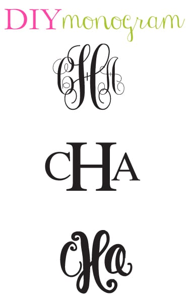
The possibilities of fonts are also endless. In the graphic above, I made monograms with Monogram kk sc, Times New Roman, and my handwriting.
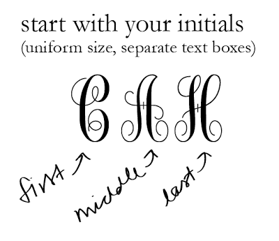
Begin by opening a new page. (All of my examples are shown being created in Adobe Illustrator.) The first step is to type your initials separately. That is, ach time you type a new letter, create a new “box” for it so you can move each letter around. It’s a good idea to keep the sizes of the font uniform, you will be adjusting that later.
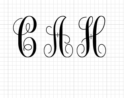
To ensure proper alignment, I like to work with the grid open.
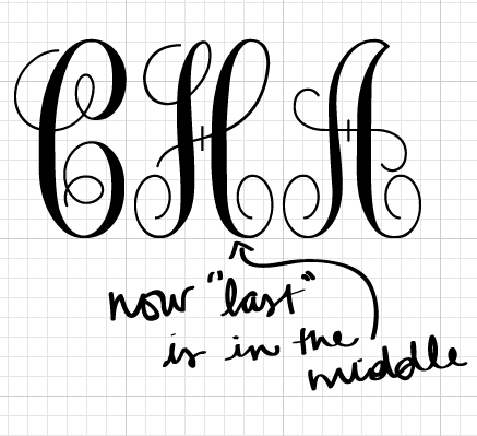
Move the middle initial, in my case “A” to the end, and move the last initial “H” to the middle.
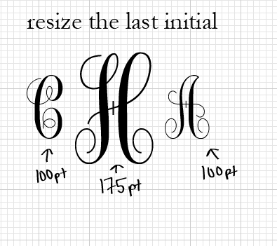
The next step is simply a matter of resizing the last initial. I kept my “C” and “A” at 100 pt. and bumped the “H” up to 175 pt. This is my personal preference for ratio, but you can really do whatever you think looks best!
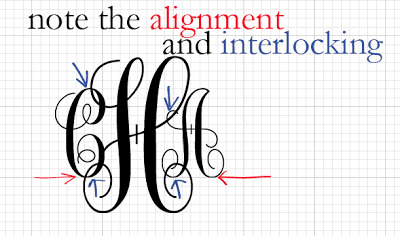
This is where the grid really helps out a lot. Notice that I kept the bottom of the “C” and the “A” on the same line of the grid. Then I can play around with how close to (or far away from) the middle “H” I bring the letters. I personally like a lot of interlocking, as seen in the image above, but you can play around and manipulate the spacing to see what you like best!
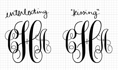
The original monogram is on the left, and then I show another spacing of it on the right. Note how the one on the right has significantly less interlocking. Instead, the letters look like they’re just touching.
Ideas on how to use the monogram:
Print your own stationery
Make a binder cover sheet
Add to business cards
Create an iPhone wallpaper
Frame a print
Have screen printed onto shirts
xoxo





It's love! I've done similar monogram designs using Microsoft Publisher, but more and more lately, I'm thinking I should spring for the Adobe software. I'd love to see more design tutorials like this one, Carly!
Love it, Carly! This is such a helpful tip to know and can lead to so many fun projects. Might need some fun, personal business cards.
Guess what…my blog is now live! evannclingan.blogspot.com
Love this tutorial, I have a feeling it's going to come in handy very soon!!!!
Please tell me if you see me putting monograms on everything in my blog : )
Thank you for posting this! I use Illustrator the most. How do you send your image to your phone if you are using it as a background, do you just email it?
girl genius. that is all 😉 love you + our mutual love of Illustrator! xoxo {av}
How in the world did you ever learn to do this?! Not that I doubt your savant-level design skills, but I just can't see how anyone would ever learn to do this stuff without you. Thanks for the tips!
Ohhh this is soooo cool! Totally adding this to my favorites to do later. You are awesome at designing!
I go to school in South Carolina and monogramming everything has become ingrained in me. I was wondering if you could tell me where you got your bracelet made though! It's absolutely precious! And, also, I LOVE your blog!
Thank you! I just got my illustrator and haven't used the software in ages. can't wait to make this into a little project on labor day!
Thanks for the tip! I was able to do it in Word since I lack the fancier programs.
Stunning…will you guide me about designing plastic business cards…
Really creative.Great post and i really appreciate you for this and this will help me in my hand embroidery service.
http://www.apparelnbags.com/custom-screen-printing.aspx
What are some of your favorite tutorials/resources for teaching yourself photoshop, illustrator, indesign, etc.?
So cute! Did you know that some of the monogram fonts will do automatic sizing? You just need to type the outside letters in lower case and the center letter in upper case. You can use character spacing to move them closer together.
Great tutorial though! Especially for the non-monogram fonts! 🙂
what font did you use?
thank you
Please make monogram iphone wall paper
How do I download this?
Thanks good to know trying it with my cricut
How do you download the monograms shown?
Hi! what is the name of the font you used for our script. Sorry if I missed it in the post.
I would like to make a monogram to transfer on to graph paper. It is so expensive to have needlepoint canvas painted. This would be perfect! I am going to try to do this.
L C T