Photos by Liv Burns
If you’re swinging by today, you may notice big changes around here. I’m beyond thrilled that my new website is finally up and running. Other than the content, pretty much everything is different. It’s been a long time coming, too. But I have to admit, I’m one of those people who resists change. It took me a long time to mentally prepare for the change. Even the day everything was switching over, I confided to my friend that I felt really, really sad to be letting go of the old. I was excited for the new changes, of course, and knew logically that it was needed and a good thing. It felt like the end of an era, though.
I started my little blog back as a little creative outlet in 2008. I had to sign up for Gmail to create my blog on Blogger. I’d write a post or two throughout the week in between classes and rowing practices. Low-quality photos and one sentence posts were totally acceptable. I had blog nicknames for everyone mentioned in a post. Over the years so much has changed, both personally and with blogging. I’ve kept up with the times in a lot of way, but my website was definitely out of date. I knew it, but for a few reasons just couldn’t let go of it.
I would start to work with a graphic designer and then panic and cancel. I’d reach out to a developer about moving to WordPress, get overwhelmed at the thought and put it on the backburner again. Rinse and repeat.
This time, I was finally ready though.
I started the process back in December but switched designers in January and that’s when things really got going. It’s been a labor of love and I’m extremely happy with how it all turned out.
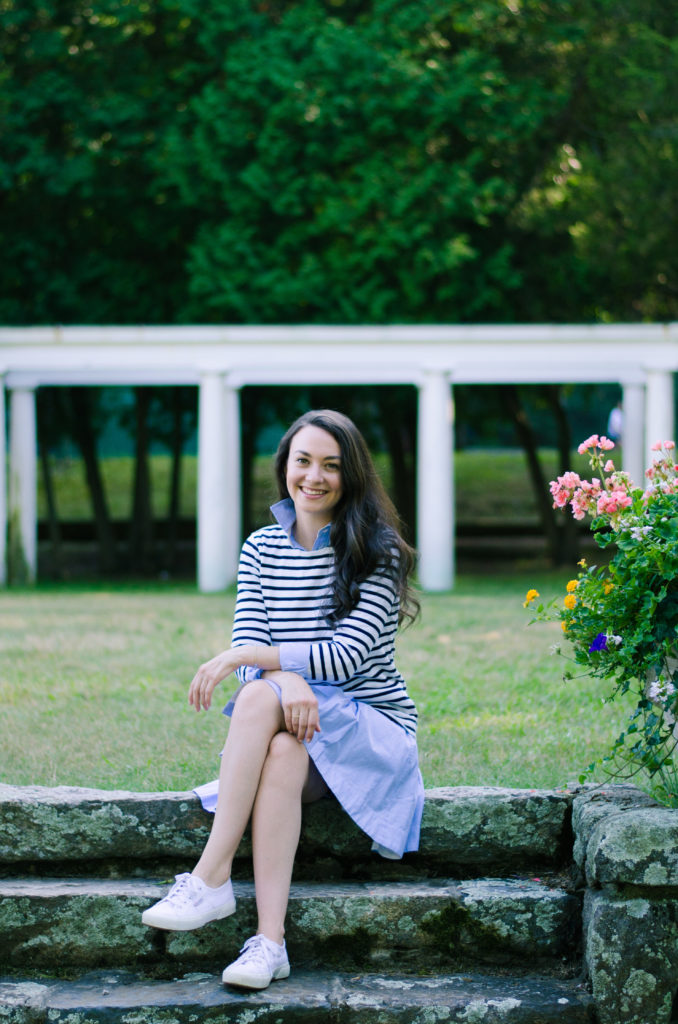
Wearing: Striped Shirt // Similar Shirtdress // Sneakers
What’s new:
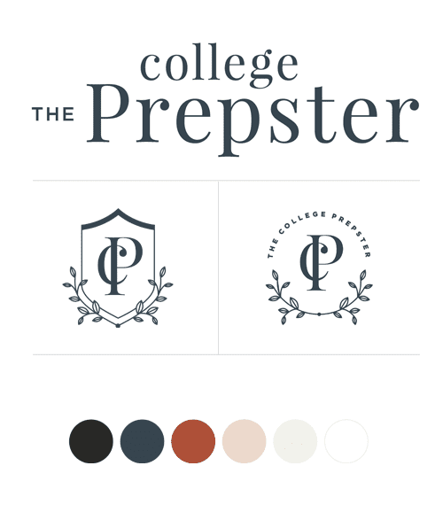
– Throughout the years, I wanted to make changes to the branding and I tweaked here or there but never worked with a legit designer to come up with a visual representation of what The College Prepster is. This was by far the hardest part of the whole process, but I just love how it came together. (It took three solid rounds of totally different designs before I felt like we had narrowed in on “the one.”)
– Adding categories was at the very top of my list. I hated that so much of my content from college was buried in an archive and difficult to find. It was an undertaking to go through every post (all 3,000+ of them) and add categories, but super worth it. Now you can… find posts just about my rowing experiences or just travel itineraries or just warm weather outfits.
– My website is finally mobile responsive. About time, right?!
While the website is live and most things seem to be working correctly, I’m sure there will be some bugs along the way. Thanks to everyone who has sent ideas and pointed out issues already, I have a running list that we’re trying to fix ASAP. If you see something that doesn’t work or looks funny or needs some kind of fixing, please email me! A screenshot and links when applicable would be great too.
I also just want to say a huge thank you to everyone who reads here. It means so much to me and makes blogging a whole lot more fun. EVERY comment and Snapchat and Tweet and email makes me feel like I have to be the luckiest girl on the planet. You guys are really the best.
Branding and Design: Rowan Made
Web Development: Chloé Digital
xoxo






Hey Carly! I’ve been reading your blog since 2010 and though I don’t know you in real life I feel like I do. I am so proud of your evolution as a person and as a brand!! Wahoo the new site is GORGEOUS! Seriously so awesome. Great job dear!!!
Love the new site! You mentioned that you did a lot of research and worked with a lot of different designers – how did you find the other ones you looked at/talked to?
Great question… I had gone through a couple of graphic designer “directories” that I found via Pinterest. I spent an entire day clicking through portfolios and seeing which designers had a similar aesthetic that I was going for. Many designers are great but didn’t have the “look” I wanted. I emailed a bunch and got quotes… And went from there narrowing it down.
I love your new site! So much more fitting to the content 🙂 mostly I’m excited about being able to comment without linking through Google!! My work email is connected to my google profile and we are allowed to comment through it!
Yay!!! Happy to hear that!!
Carly, I so love your new design! It’s the definition of you: sophisticated, to the point, and a little bit of flair! I’m so excited for this new chapter 🙂
I’ve read your blog for years and I must say I love the new look!! xoxo
This is so exciting! Congrats! It’s been so fun seeing the blog come along–been a reader since ~2009.
Carly, the blog looks fantastic! I’ve been a loyal reader since day one when I stumbled upon your blog as I was preparing for my freshman year of college in 2009. The design is so reflective of your taste and truly where you’re taking the blog. Love it! Hope to meet you in person some day, Tennessee would love a visit. 🙂
Carly, I truly love the new look. I’ve been a loyal reader since the very beginning when I stumbled upon your blog as I prepared for my freshman year in 2009. The design truly reflects you and where you’re taking the blog. Love it! Hope to meet you someday, Tennessee would love a visit. 🙂
I’m sure this looks AMAZING, but I’m so sad you moved to WordPress. My employer blocks all WordPress styling so I can’t see anything anymore – just text and blue links. I’m going to miss reading your blog at work every morning! 🙁
Ah! Try downloading my app! Search for “college Prepster” in the App Store- also a fun way to read the content!
The site looks SO good! Congrats on the new design Carly!
xo Jen
Skirt The Rules
Love the new blog look!!
I’ve been following you for a little bit but long enough to notice the difference. Absolutely love it! The site looks ‘grown up’ and super chic! Great job and congratulations!
-R
Carly, I LOVE the new look!! I’ve been reading your blog for years and the new design definitely embodies you and how you’ve grown!! So excited for you!
I’ve been following a long for quite some time now (I remember when you changed to tortoise shell and pink!) and I love the rebrand!! I feel like it’s the perfect testament to the new chapters beginning in your life!
Tori
http://www.mooretori.com
The new site looks great! Congratulations! Xo, MacKenzie
Hey Carly! I started to fall in love with you and your blog from your snapchat videos! I love the new blog design it is so classy and perfect for you! Congrats girl!
Good morning, Carly! I LOVE the new layout, but miss the bright pink, green and other Lilly-esque colors. Still, thanks for updating, the new logo seems SO you. Peace.
Love the new look Carly! Congratulations 🙂
Congrats on the beautiful, new design! I’ve been a reader and follower since college, and in many ways this blog has inspired me to stay positive, write my own blog, and to document my life. Can’t wait to see the next step the blog takes!
Really love the redesign, Carly! (And it’s so much easier for me to comment now versus the old way!)
Carly,
Your new design looks gorgeous! I love how easy it is to find your old posts now (they are WONDERFUL!). I must say, I was reading them all last night (:
Kalina | Simply Semisweet
I love the new look, Carly!
It looks beautiful!!! So classy and classic, just like you! 🙂
This is so exciting, Carly! Congrats on this milestone and keep up the awesome work. I have enjoyed your blog since second semester of my first year of university (Jan 2009) and it has been awesome to follow along as you and your blog grow and change.
Hi Carly!
I think your new website is gorgeous! I especially love the new logo – it is so classic and sophisticated.
Always love reading your blog (since 2011!)
XO,
Hannah from HMS Jewels
http://www.hmsjewels.com
Everything looks amazing! What a small world – I’ve been following your blog for years and also worked with Breanna a few years ago (on the branding for my family’s restaurant – http://www.1913roselle.com). She’s the best!
Wow! What a gorgeous new site. It feels much more grown up and reflective of your personality. I am a long-time reader and am loving your Snapchat! How do you find the balance between work and personal life? I’d love to know.
I love your new design, Carly! I also would really appreciate it if you could do a post on the process. I know you mentioned who you did everything with, but what were the steps like? I would love to update my blog & swap it over to self-hosted, but it’s so intimidating and I would love some help from someone who just did it!
Thanks in advance!
xoxo, SS
Southern And Style
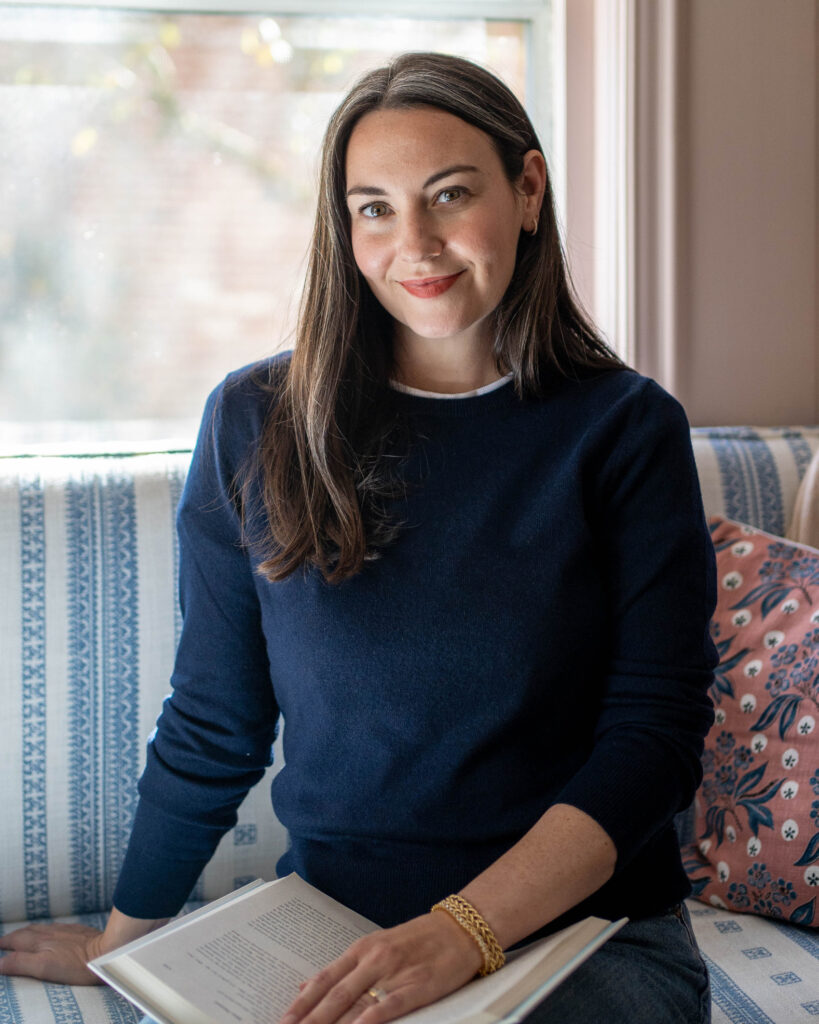
The new site looks great Carly, well done! Loving the new look and the head shots are adorable! We all make changes when the time is truly right and you were finally there! xx Rox-Anne, Celebratingthislife.ca
I love it Carly ! Everything about this new design is so pretty !
Carly! Everything looks amazing! I have been following your blog since college (we are around the same age.) I talk about you as if we are friends! The navy-ish coloring is perfect! Keep working hard. xo Courtney
I adore your new site, Carly! I’ve been following you for a few years now, and it’s so much fun to see your blog grow! 🙂
It’s gorgeous and so you! I have such a hard time letting go of things too, and I’m a very nostalgic person, so I understand! But I also love that I can use the categories now. Congrats!
xo,
Catherine
http://www.classiccatherine.com
Carly, it looks so good! Congratulations – I love the branding. xoxo
Love your new site Carly! 🙂
x Tali
http://www.stylewithtali.com
The new site looks amazing! Congrats Carly! xo
That moment when you try to leave your blog as a link and end up linking the youtube video you sent to someone else earlier – sorry!
-Katie
https://itsgoodpracticeblog.wordpress.com/
Your new website looks SO good! I’ve been anticipating it ever since you announced that you’ve been working on it. The design is so clean and elegant. -Audrey | Brunch at Audrey’s
I have been reading for SO long (6, 7 years maybe?!) and this design is what made me finally comment. I am a professional graphic designer with a design degree and I am giving you and the designer major kudos! Everything looks great.
Love the new website! I’ve been reading forever and love looking at your old posts which are so much easier to see now. The design is beautiful too!
Congrats! Looks great!
-Meg
http://www.smalltownsisters.blogspot.com
Absolutely adore the site.
Two things I noticed.
Firstly something I just discovered, who you tab between each of these fields I’m writing in, it doesn’t work well as after website I move up to the search field – not great for lazy people like me 😉
Secondly, don’t get me wrong I really love your logo but I keep reading it as ‘College the Prepster’ – the ‘The’ is in such a weird position. Is that only me?
Great site though. Will continue to read even though we are both well out of college now. 🙂
LOVE IT!!! So fresh and sophisticated. It’s great to see how you’ve evolved over the years, both as a person and blog/blog design.
Congratulations on the new look! I really love it and it’s an exciting change. Enjoy it!
It all looks so great Carly! Love it and congrats!
I love your new look so much! It’s fresh, but still unique. I’ve been a faithful reader for a few years now, so I feel like I can credibly say it’s very you!
I love the new look, definitely was time for an upgrade and it was well worth the effort! This site reads much more professional and polished, perfect for everything you’ve built it up to be!
Laura | Laura Aime Vous
The new design is stunning! Everything looks amazing!
Kari
http://sweetteasweetie.com/coconut-shrimp/
I love your new website! I’ve been following you blog for years and have absolutely loved watching everything evolve.
Love your new site!
Love the new site design! Congratulations!
xo Jessica
http://www.whatsfordinneresq.com
Congratulations on the new site, it looks amazing! One thing that I love to have as a reader is an easy way to go through several posts seamlessly, whether that’s not having to click through to see more (your old site) or just having a click to see older or newer post button at the bottom of a post. I would love if you could add that!
Carly, the new layout is gorgeous! Simple, organized, and straight to the point. Congrats on the new look! So fun watching TCP continue to grow and evolve.
http://www.keepingupwithkahla.com
Hi Carly,
I’ve been reading your blog for ages ( i remember when it was pink & tortoiseshell, and I love how clean, crisp and beautiful the new updates look. It’s a gorgeous website now, and I can’t wait to see all that you do on here! Xoxo Sandy
Hi Carly, I’ve been reading your blog for years, back when one sentence posts and low quality pictures was the norm 😉 And just wanted to saw I LOVE the new design and it feels so authentic to who you are. I feel like we’d definitely be friends if we knew each other outside of this blog. Keep up the good work!
I was ill for some time and haven’t read your blog this time, so today when I saw a whole new TCP I was soooo impressed. This is wonderful, great job Carly! I’m a fan of yours for more than 3 years now and read every single blog you post. You are my inspiration and the biggest “reason” why I started my blog as well.
Love from Slovenia, Europe. <3
I really love the new branding, feels much more grown up!
Kristina does the Internets
I LOVE the new look and all of Breanna’s work over at Rowanmade. As a designer, I’ve followed her work for years and I am obsessed with her style. I have also followed you for years and am happy to see something fresh!
I absolutely love the new look! Personally, I am happy to see the category links above. So much easier to search for past posts that I want to re-read!