At long last, I had Julia come over to photograph the spaces we redecorated!!! I’m thrilled to be able to show you the new grandmillennial style spaces. It feels like we live in an entirely new home– this has been so transformative and I love everything. It feels so…. us.
Design is just so personal and this is our home! I don’t plan on redecorating and wanted something that worked for us long-term…. so finding someone who understood what we liked and could also push us outside of the comfort zone of “what we know” was important to us. I actually met Jennifer Muirhead at a creative conference a few years ago so she had been on my radar for a bit. She doesn’t just do grandmillennial style spaces and I admire how everything she designs is SO inviting.
Originally, we didn’t see ourselves in our home for that long, but considering the real estate market right now, we realized we would probably be here longer than anticipated. Because of this, we felt comfortable making the investment in grandmillennial style design. Like let’s really make this place ours now. I will say, I’m really glad we waited. We bought our house in 2019 and our needs changed pretty drastically since then. In this time, we were able to see how we actually used spaces, not just theoretically how we thought we would.
For now, we focused on four spaces that I felt like needed the most attention. (Though now that we’re done, I have another laundry list of things I want to do because isn’t that how it works?)
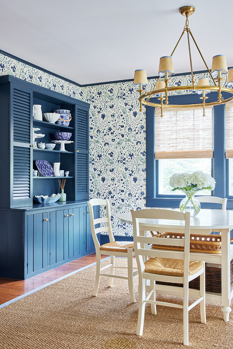
Dining Room: This was a total blank slate. We don’t have a table in our kitchen, so it is more than just a “formal dining room” that gets used for special occasions. This ends up being the focal point during family meals, where we gather for dinner parties, and doubles as extra working space during the day. With the layout of our first floor, it actually also ends up being a major “artery” so to speak for flow.
Here’s where we stood before we invested in our grandmillennial style redesign….
Living Room: Oy, this living room is a funky one! It is very narrow and very long, and it left me stumped. I did my best, but knew it wasn’t totally maximizing the space to its full potential. It also doesn’t get a lot of light so it felt kind of drab and dark throughout the large majority of the day. Even though it’s a big chunk of the square footage of the first floor, we rarely used this room.
Primary Room: Our primary room is also a bit weird. (Our house was built in the 30s so there are just little quirks in every room!) It’s actually not the biggest bedroom, but it is the one with an en suite bathroom (tiny, but it’s connected!). The location of the windows, the closets, and the bathroom leave very little room for interpretation. The bed can go in exactly one spot and one spot only. I struggled to make this room feel like a sanctuary from day 1….
Guest/Jack’s Bathroom: This was the space I wanted to redo the most. This bathroom bothered the heck out of me from the second we toured the house. Namely, the tile floor was this weird matte finish that grated on my senses in the very worst way. I couldn’t walk barefoot on the tile I hated it so much 🫣. I mostly just avoided the room… until we had Jack and then we were using it on a daily basis. The bathroom was perfectly fine before and didn’t “need” a facelift, so this was a pure want.
I’m going to let the pictures here do most of the talking, but here are the grandmillennial style spaces!!!
DINING ROOM
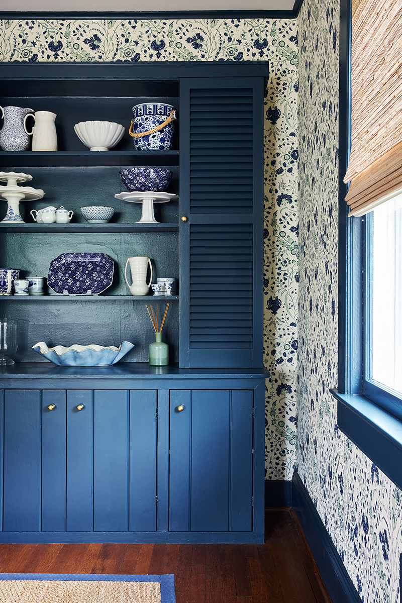
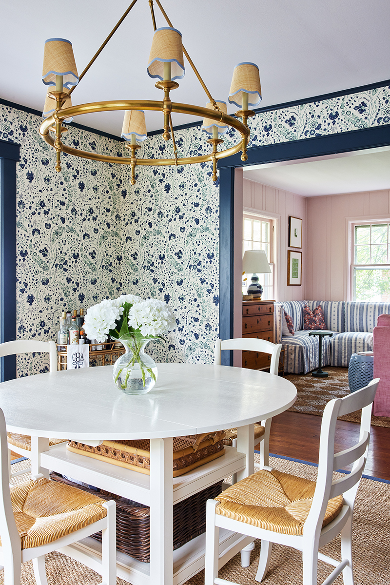
This is the grandmillennial style dining room of my dreams! Now I can’t believe we just had white walls with white built-ins before?! Despite its boldness, it somehow ties together our sunroom, living room, and entrance into the kitchen beautifully. I also love how the color makes our grandmillennial decor in the built-ins pop. If we’re still here when we’re out of the baby/toddler stage of life, I would love to replace our table and chairs with something more grand. But keeping it real with the table we have because we are just not in a stage of life where I want to have a table that requires more fussiness since it’s our everyday dining space.
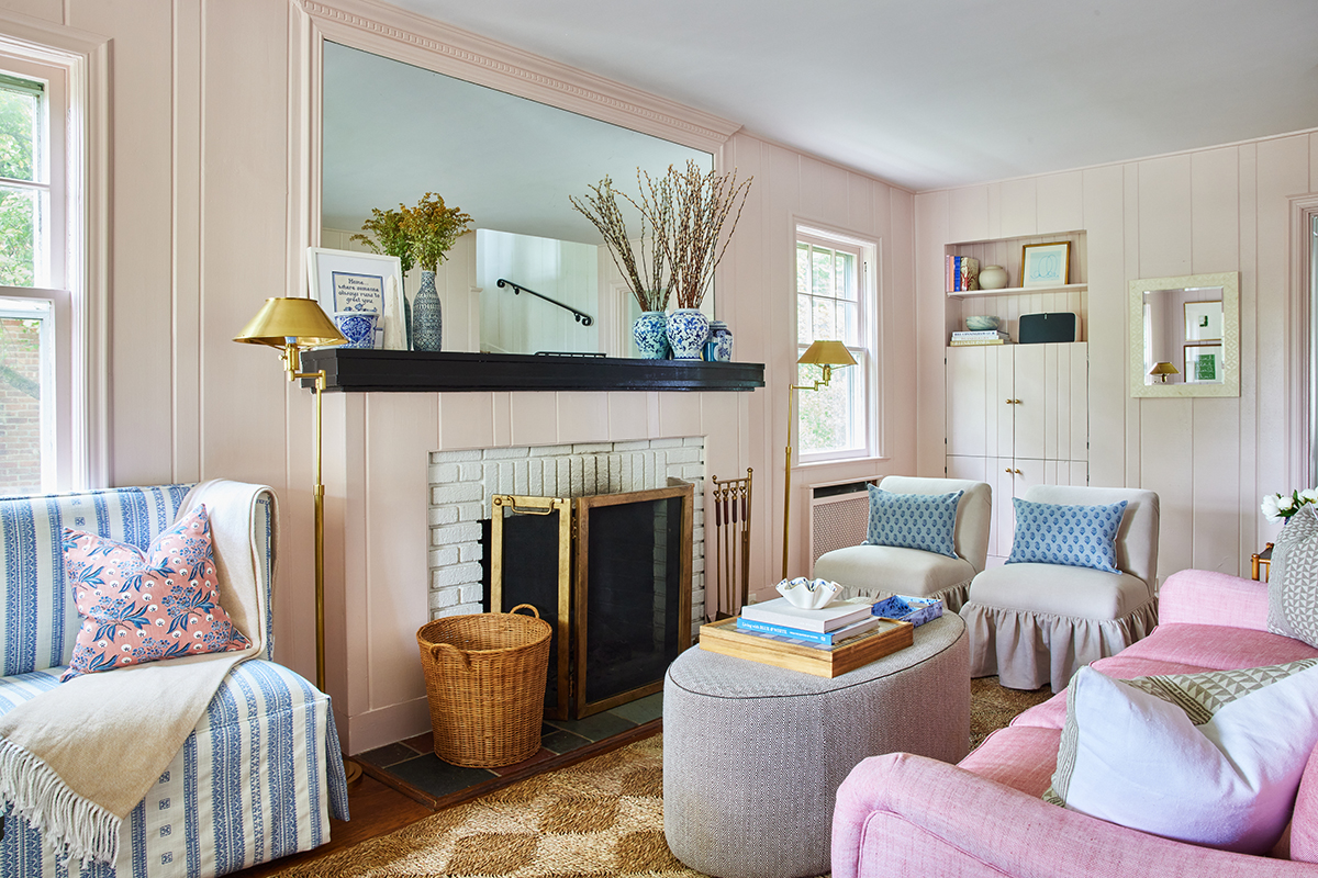
LIVING ROOM:
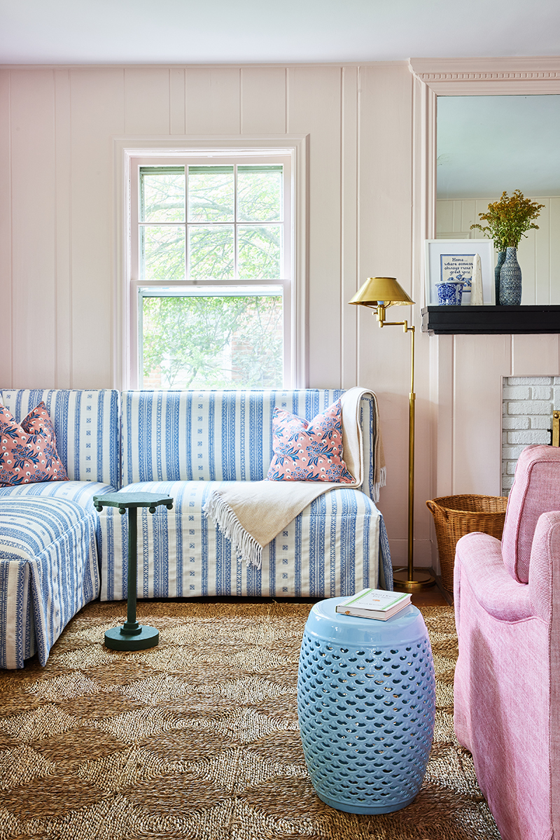
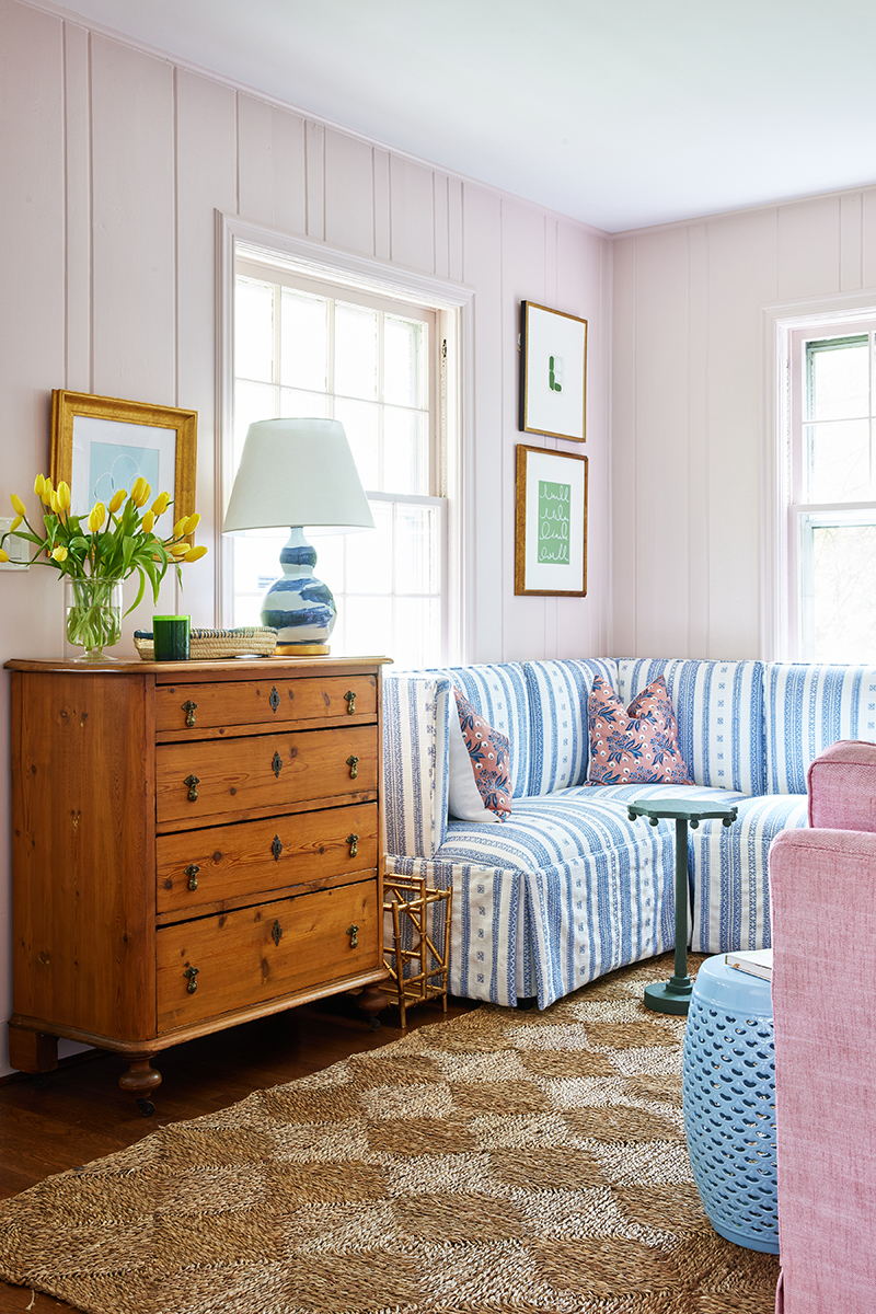
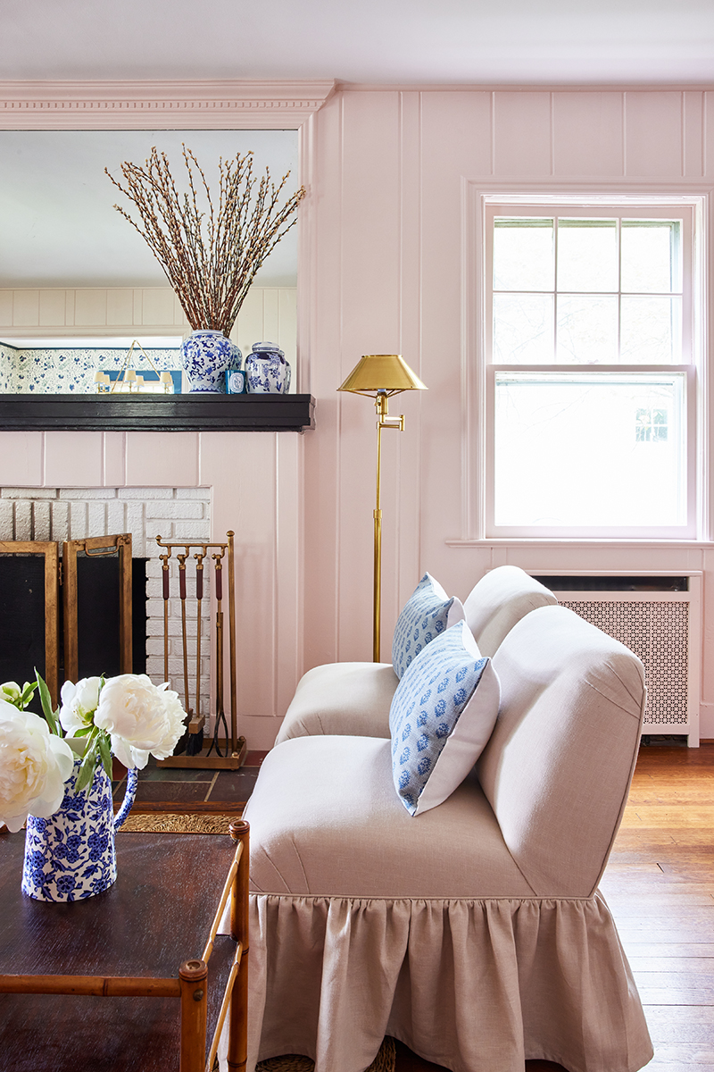
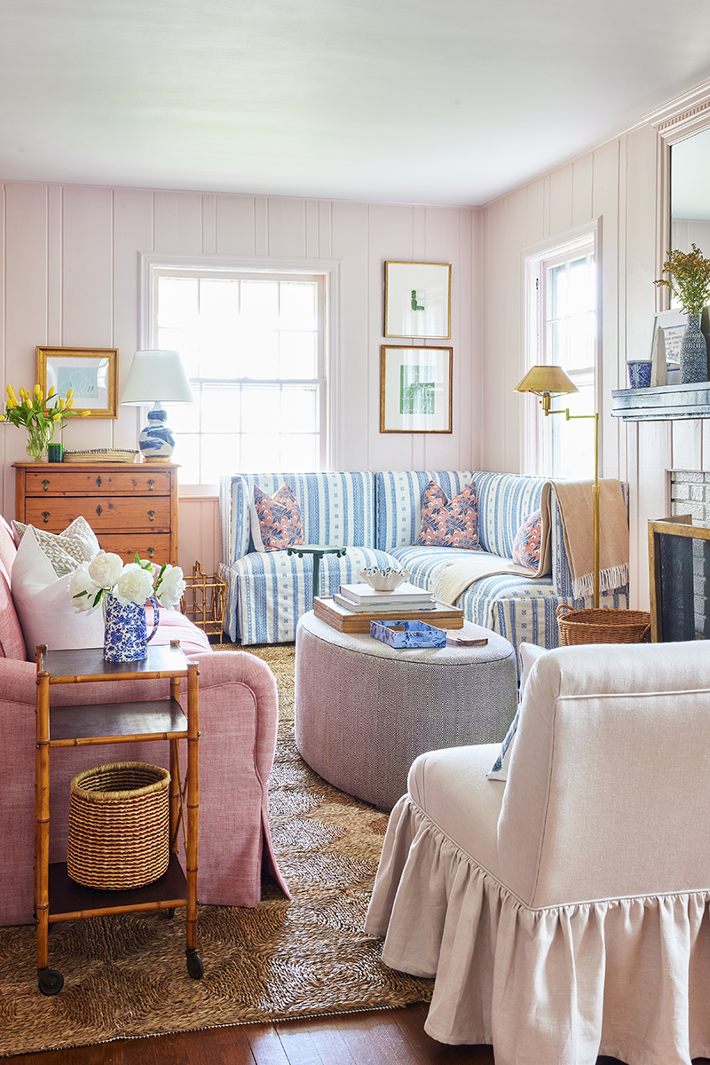
When we got the presentation for the grandmillennial style rooms, this is the one I was most excited for…. and also the one I struggled the most to envision in real life. The pink seemed a little scary to commit to, but it ended up making the room feel soooo much brighter and more open. Everywhere you look is grandmillennial decor! The banquette seating also elongated the room and now (!!!) we love to spend time in here as a family. It’s especially cozy in the morning when the sun beams through the windows. (We are adding the same window treatments as the dining room in here, I just couldn’t wait to take the photos to share so that will be an update in the future…)
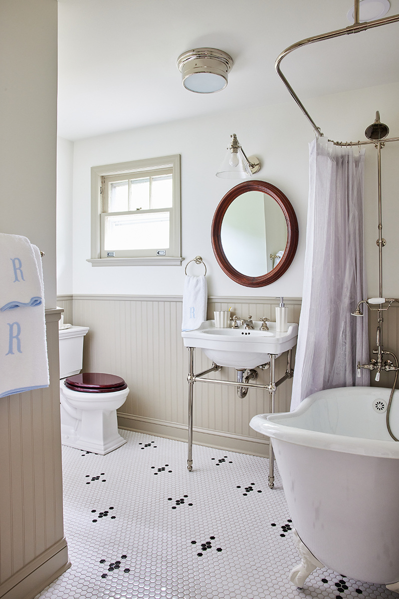
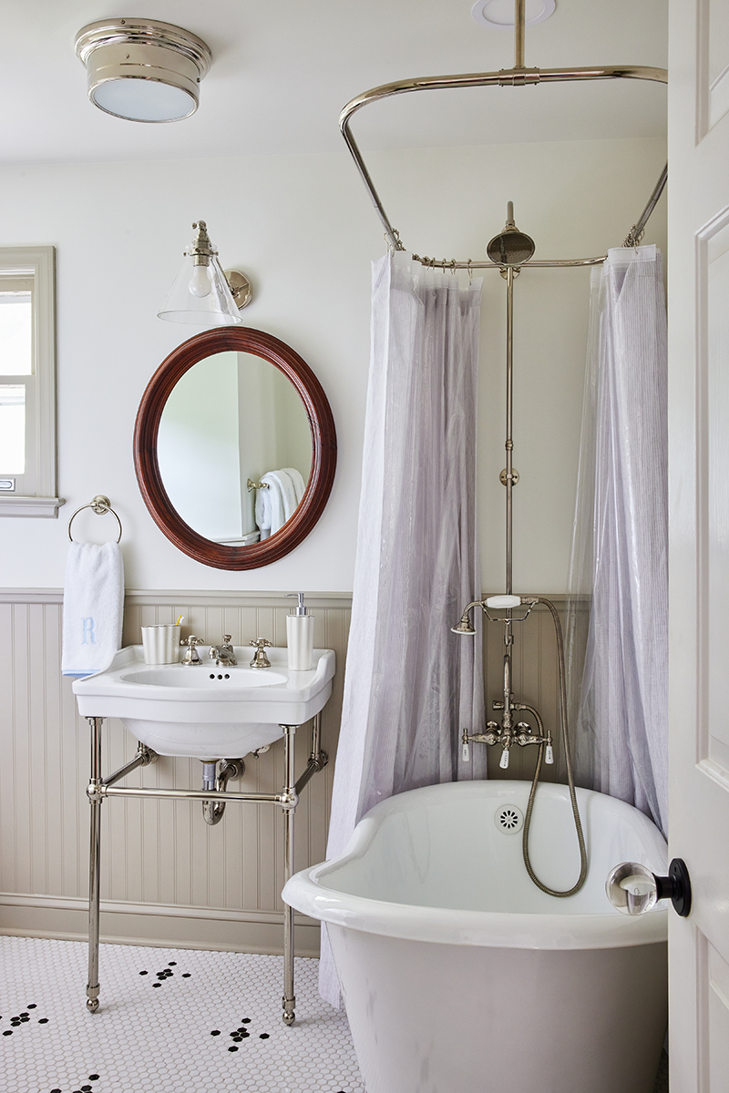
GUEST/JACK’S BATHROOM
This was a delightful change! Totally unnecessary on paper…. but the joy it brings is immeasurable! The classic interior design has charm and character and matches our house so well. And yes! I can walk on the tile without shoes now.
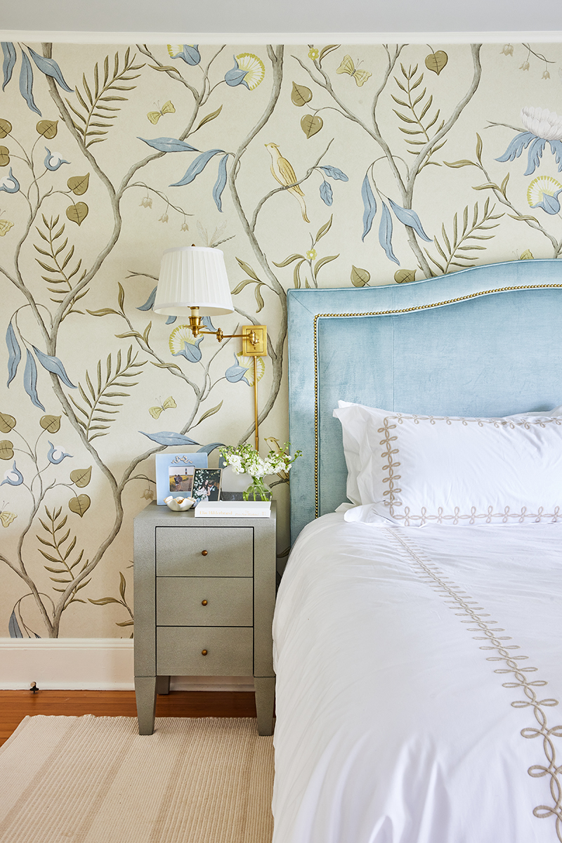
PRIMARY BEDROOM
Our boring bedroom was transformed into a grandmillennial style haven!!! This ended up being the best of the transformations in a way I wasn’t expecting. It feels like such a special space now and somehow feels two times larger, even after upgrading from a queen to a king sized bed.
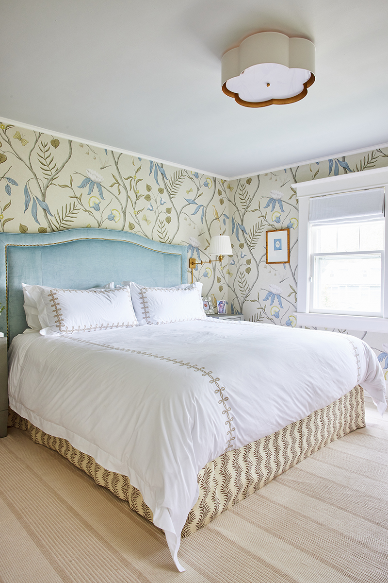
A lot of the furniture is custom, but I’ll do my best to link to sources or something similar when possible:
DESIGNER: Jennifer Muirhead Interiors
I cannot recommend Jennifer enough. I trusted her inherently with the designs and I was blown away by what she came up with. She matched the character of our home with our family and created grandmillennial style spaces we will enjoy and grow into for years to come.
DINING ROOM:
Wallpaper: Soane “Dianthus Chintz”
Paint: Farrow & Ball “Hague Blue
Chandelier: Rosecliff Chandelier
Rug: Custom Color-Bound Seagrass Rug
Table & Chairs: Old Pottery Barn
LIVING ROOM:
Paint: Farrow & Ball “Calamine”
Custom Banquette: Similar
Custom Sofa: Similar Sofa
Antique Dresser: Similar
Custom Chairs: Similar
Custom Ottoman: Similar
Pillows: “Henriette”
Rug: The Rush House
BATHROOM:
Tub: Signature Hardware*
Shower: Signature Hardware*
Sink: Signature Hardware
Vintage Mirror: Similar
Towels: Weezie Towels (c/o)
*Would recommend going with something else because it was too difficult to install
BEDROOM:
Wallpaper: Lewis & Wood “Adam’s Eden”
Custom Headboard: Similar
Linens: Matouk
Nightstands: Sorin 3-Drawer Nightstands
Sconces: Visual Comfort
Rug: Annie Selke









I love it! These rooms definitely feel like you but an elevated you (if that makes sense). Is your living room also where your TV is? Or do you have that somewhere else?
Our TV is in the family room, which is the room our kitchen opens up to! https://carlyriordan.com/our-family-room.html
Absolutely gorgeous! Any chance you could share the colors in the bathroom? Our house is built in 1910 and I’m thinking of flipping the beadboard/wall combo this summer. Love the look! Thanks.
I love the spaces and design! So classic and timeless!
http://www.elspethsdaybyday.com
Sooooo pretty!! Are you going to share any before to go along with these afters? 😍 I love everything and wouldn’t mind a week’s worth of posts on it all!!!
Agreed!
Also, just curious what you store in the dresser in the living room? Love the functionality of it – I am inspired to do something similar!
Not that exciting but things for the dogs (poop bags, their coats, spare leashes), some of our board games, some spare votive candles, etc.
Thank you for sharing! It’s lovely and thoughtfully designed.
Do you have a mattress recommendation?
We went to a mattress store and tried a bunch as a couple to see what we preferred!
Do you have before pictures? I love the banquette in your living room. The rugs are great. I’m hesitant to do sisal in anywhere other than our bedroom. Such bold and personal choices… must feel surreal to have it all come together!
Any chance you have a link for the blue stool in the living room? Everything looks amazing! Congratulations!
The exact one is sold out but it’s by a company called “Three Hands Corp”
The bedroom is my favorite! I have to ask, what happened to those lovely blue bowed chairs you got off Facebook marketplace?
I have them! If I find the right dining room table down the line I’d love to use them in the house, but for now I’ll be using them in my new office space in town!
It’s so beautiful! We are doing a “pink” room too, so that was a fun surprise to see how yours turned out. Congratulations on a long process that certainly shows your personality!
Honestly we were both nervous! Especially once the pink walls were painted without the furniture. It was SO pink, but we trusted the process
Carly, this is stunning!! Such a beautfiul home.
Looks amazing!!!
It’s beautiful, and it looks SO you! I have one question – and I definitely don’t mean it to be a catalyst for negative commenters (so delete if necessary) – how did you sell Mike on the pink living room? I love it, but I’m certain my husband would veto it, immediately.
I love every part of this reno – congratulations!
I’ve found myself (single female solo homeowner) living in a very pink/blush walled house and almost everyone who sees it doesn’t even notice that it’s PINK – I kept saying I wanted a ‘warm white’ and turns out… that is either yellow or pink 😂
Lol Maybe I just tell him it’s a very warm white….once it’s on the walls, we’re not going back! 🤔😂
Stunning and unique! Looks like it’s straight from a design magazine!
Carly I absolutely LOVE what you’ve done! I love the color and how it’s so different and “you”. I’m definitely going to be taking some inspiration from this!
The way I FEEL your comment about the bathroom tiles! We have a rug in our kids’ bedroom that is just awful on bare feet and it has to stay for the time being. I feel so much less crazy hearing someone else feel that way! All that aside, this is so beautiful and vibrant!
So stunning! Do you mind sharing where the woven window treatments are from in the dining room? Xx
After seeing sneak peeks and waiting with such anticipation, OMG Carly it’s SO much better than I imagined. The colors play is gorgeous, and I can’t wait to see the window treatment installed in the Living Room. That will definitely be the cherry on top.
Carly, I absolutely love it!!!! It’s classic and timeless… but still FUN. Well done!
I’ve been dying for this post ever since you’ve shared sneak peeks on IG! Everything looks incredible, congratulations! Where is the ceiling light in the bathroom from? I’ve been looking for one just like it!
Never in a million years would I sign off on a pink living room but it is flawless and so lovely! Beautiful design overall. Thanks for sharing!
THE LIVING ROOM! The pink is perfect and fun and yet totally ‘you’.
What a fun refresh! Can I ask how that tub is working out with Jack? Having a hard time envisioning how I’d be able to wrangle my kid in a beautiful tub like that!
Gorgeous! I’d love to see before/after side by sides!
Where are the light shades from on the dining room chandelier? 🙂
I think pink is underused and underrated in home design. It’s a wonderful neutral. My house was built in the 1940s, and I painted my kitchen pink. I love what you done with your home. It’s so beautiful. I’m not a wallpaper person but your bedroom paper is to die for.
Oh wow! Gorgeous transformation. I love all of these rooms and I could not wait for this post!
The pink couch is so fun. I have followed you for years and years and convinced myself I needed a pink couch in my first apartment because you had one in your first apartment and when else could a girl have a pink couch?? Life is so funny. Now I need to install wallpaper in all of my rooms!😂
Bravo!!! Love it so much! Enjoy your beautiful home and thank you for sharing!
I would love to get my husband to agree to some pink here and there and some patterned wallpaper but I feel like it would be a really hard sell. How was Mike involved in the design process? Were there any “must haves” or “must not haves” for him?
I love it all! Absolutely love the pink and blue living room. My living room has pink and blue too and you have inspired me to get a ruffled couch or chair for it.
This is all beautiful! Do you find that the sisal/seagrass rugs are rough to walk on barefooted? We also have a toddler who’s just learning to walk, so I’m sensitive to how it would be on his little feet. Does Jack seem to mind? Thank you!
Oh, Carly, it’s beautiful! Lovely, just lovely.
Gorgeous! And totally you!
Have you written at all about the process of hiring a designer and how you evaluated the investment? I’d love to go down this route but it’s hard to envision how to get started and how much to budget to work with a designer.
Beautiful outcome, so well done. Really showcases how a professional (and you as a client who fully trusted in their skills) can elevate spaces. The living room in particular is amazing 🩷
It’s stunning! Love the pinks, blues and neutrals together- such a happy and classic combo!
Oh wow, it is STUNNING! So you, very classic, but also not predictable at all. You and your interior designer nailed it!
Omg your bedroom wallpaper was the one in our wedding venue! I was so inspired by that I drew our monogram based off it and lined our envelopes with the pattern. Absolutely killed it in every room! By any chance do you know the bathroom paint color too? Would be perfect for my living room board and batten Reno.
Love it all! I remember you posted on Instagram about dining chairs with blue bows on them- did you end up getting those?
Yes! Using them in my office space!!
The wallpaper,& paint selection in your eating-area is so vibrant; it gives the room such a cozy butler’s pantry/breakfast nook vibe!
This looks amazing. I love the timeless, yet not dull, style throughout each room. Add me to the list of those wanting before pictures!
Thank you for sharing these sources and your beautiful home! Definitely eyeing that Ballard banquette for my living room now 🤩
It’s SO beautiful! I have been dying to see it all and it’s so good. I am obsessed with your bedroom, it feels like a boutique bed and breakfast you’d never want to leave. I hope to invest in a designer some day. So beautiful and makes it feel so cozy and homey. LOVE
Carly!
Good grief – this is unbelievably beautiful! I am absolutely thrilled for you and the family to live in such a lovely space. The blue paint on the trim in the dining room is timeless, the softness of the living room is stunning, the bathroom is iconic!
Everything looks wonderful, everything matches, such an adult sophisticated home. So happy for you.
I can’t express how much I love this… it’s magazine-perfect and also, just cozy and inviting. Amazing job, Julia! These photos belong in an interior design book.
xo,
Em @ BloomingMagnoliasBlog.com